The Process of Designing a Magazine Article
A step-by-step visual essay.
By P. Kachu | April 20, 2024
We’ve all been there before: staring at the blank slate of a document that needs to be designed. It can be intimidating to know where to start, especially when there are so many resources at your fingertips and so many directions to take your piece.
So what do you do? Should you curl into a ball and have a break down (definitely not from experience), or maybe procrastinate on your phone for hours on end? Well, to prevent headaches and frustration, I like to follow a simple procedure to help me find my way to cohesive, yet unique article designs. While you don’t have to follow in this exact order, these can be some generally good tips into how to get the ball rolling on your design.
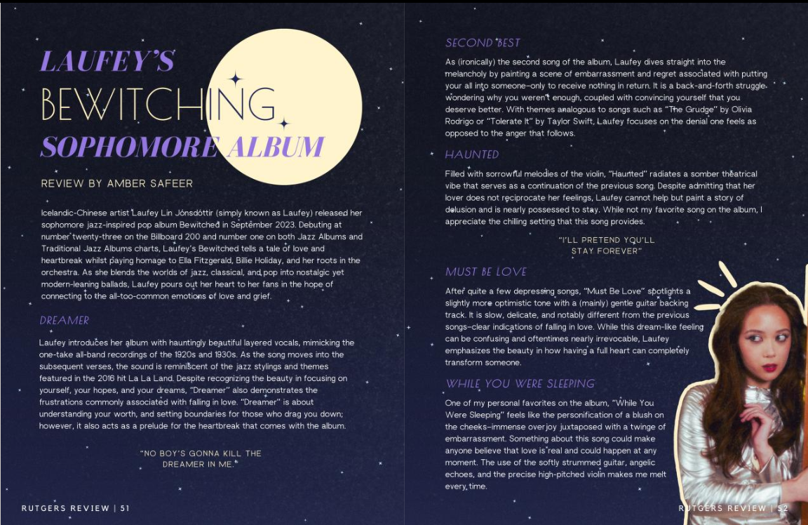
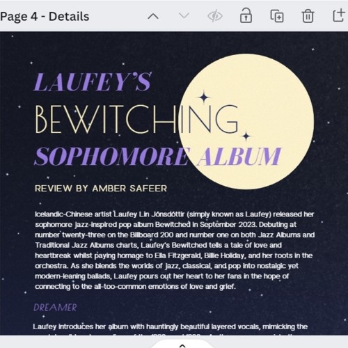
For this essay, I decided to take a look into my article “Laufey’s Bewitching Sophomore Album,” a review about one of my favorite musical artists and their most recent album.
1. Reading the Article
Before you even touch a designing software, it is imperative to read the piece you are designing and understand what it is about and the overall tone of it – is it satirical? Serious? Playful? These are important as it will determine how your design will turn out.
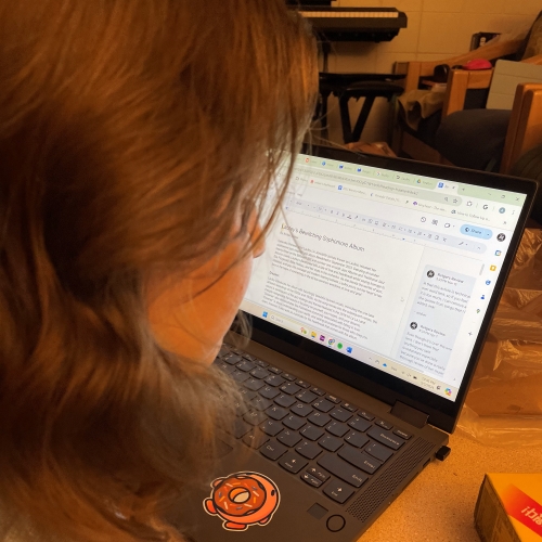
In this example, I wrote the article myself. However, re-reading it helps me determine that there is a relatively serious tone as it is a sincere review of the songs.
2. Talk to the Author
If you didn’t write the article yourself, talk to your author: they may have ideas or certain photos they would like to have displayed in the design. While this doesn’t apply to the article we are talking about today, I have designed numerous pieces that I did not write, and as such, it was important to communicate with the writer.
3. Google Is Your Best Friend
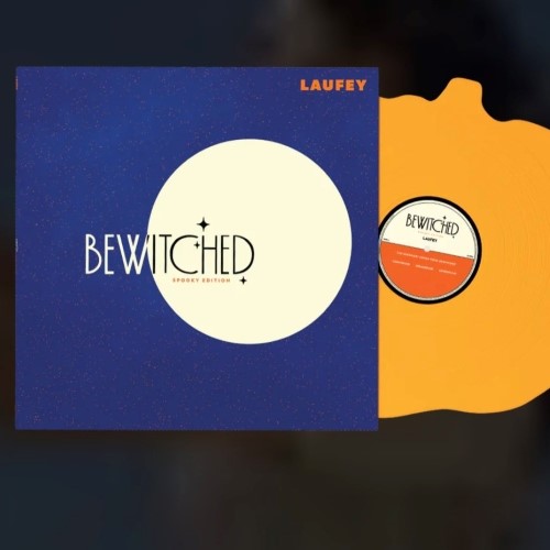
Google, Pinterest, and search everywhere for topics related to your article. This can help develop ideas of formatting, color schemes, and more. I made sure to research a lot of content related to the Bewitched album and Laufey as an artist. There was one album cover in particular that I absolutely adored the design for; Bewitched (Spooky Edition). It was simplistic and elegant, much like the written article was. I had found my main inspiration for the article.
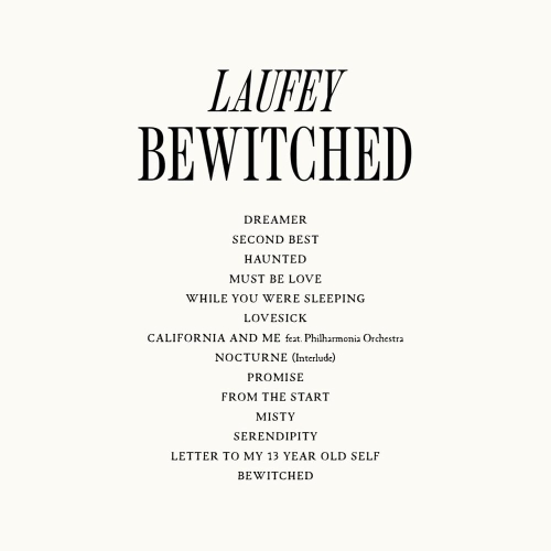
Laufey Bewitched tracklist, via Genius.com
4. FONTS!!!!!!
Fonts are extremely important when it comes to designing an article, because it is the thing you will actually be reading. You must make sure that while the font is eye-catching, entertaining, and matches the vibe of the design, that it is LEGIBLE.
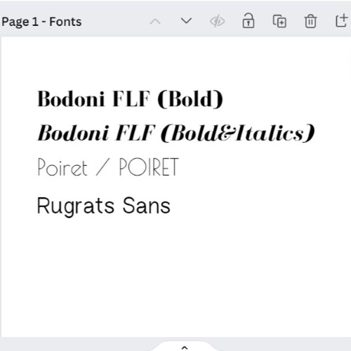
Returning to my Bewitched article, I knew that I wanted to use fonts similar to the ones found in the album cover. It took some digging and research (thank you Reddit!), but I eventually found two fonts on Canva (my design software of choice) that matched the originals very well: Poiret and Bodoni FLF.
However, these fonts are what I would classify as “display” fonts. They’re great for titles, headings, and anything you need to stand out, but they’re a no-go when it comes to paragraphs. So, I decided to find one more font to add to the design; I chose something sans-serif because I felt that a serif might clash with the rest of the vibe (sometimes, you just need to go with your gut). I chose Rugrats Sans, because it is very legible, but slightly rounded and soft which adds to the lovey tone of the songs and album I was reviewing.
Stick to 3 fonts MAX! If you have too many fonts, your eyes will notice. Oftentimes the design will just look busy and quite ugly if there are too many fonts used. To get around this and provide variation, utilizing bolds and italics are a great way to maintain consistency while breaking up the design. For example, for the song title headings, I used the same font as I did for “bewitched,” but slanted it to keep it different from the title and the un-italicized paragraph fonts.
5. Color Scheme
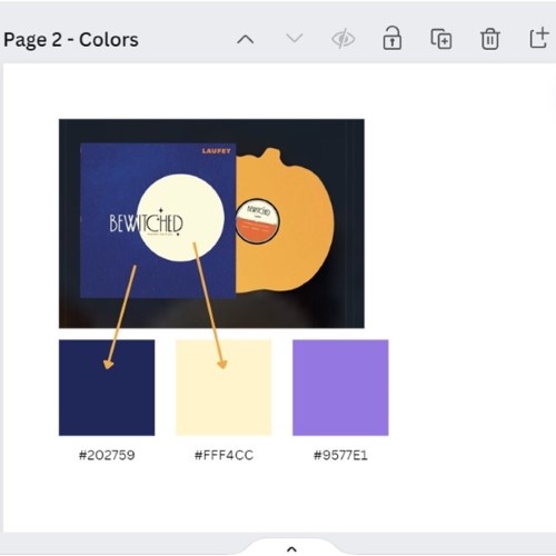
Much like fonts, you want to limit your color palette to avoid distractions and overwhelming your reader. Finding a color palette on websites such as Coolors.co or perhaps taking colors from a specific image you want to use can help to unify your design. With my article, I wanted to take the colors from her album and incorporate it into the design, much like I did with the fonts. So, I found a dark, somewhat desaturated indigo (#202759) and a light, creamy yellow (#FFF4CC). Because I still needed at least one another color to stand out against both of these, I chose a bright lilac (#9577E1, which I utilized throughout the headings). I chose white for my body text for legibility, though the creamy yellow could have been an option too.
6. Added Details
Details and extras can make or break an article design. Sometimes articles are begging to be extremely minimalist, while others desperately need a little push towards glamour. Once again, assessing the written content of your piece, the colors, the fonts, and more can help decide how over-the-top the article should be. This is also dependent upon whether you are designing just one article, or for a whole magazine that needs to be unified.
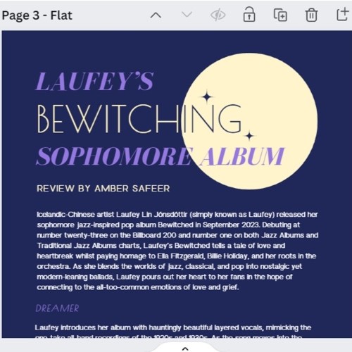
For this example, everything just felt very flat to me once the colors were in. I knew that I wanted to add the artists’ image into the design as well, however I had to be smart about spacing and font size to make sure that it would all fit within a reasonable number of pages. The first thing I did was make the background subtly space-themed, with a slight gradient and sparkling stars. It went perfectly with the moon (and the theme of our magazine, “Moonstruck”), and it wasn’t too much to where it would distract the reader. I also added in some images of the artist like aforementioned and dawned her with a yellow border to make her stand out and really glow. The last thing I decided to do was add a very subtle grain to the background and the additions. It added just the touch of dimension I was looking for, and made the article feel just a bit more retro (as many of the artists’ songs reference jazz, something started in the early 1900s).
Some Extra Notes:
- When it comes to fonts and font sizes, make sure to pay attention to line heights and letter spacing; many times articles appear to be endless because the letter spacing is enormous and you don’t notice. You can play around with these features in order to get something that fits the length you are looking for.
- Adobe Stock and the free Canva gallery are great resources for finding elements related to your design.
- Don't be afraid to look up tutorials or experiment with new programs! Different softwares have a variety of resources to offer; it is what is best suited for your needs.